Simulating connectivity.
Overview
Teaching: 30 min
Exercises: 0 minQuestions
What’s with that paper from Steve Smith?
How can I simulate functional connectivity between regions with R?
Objectives
Have a basic understanding of where the data comes from.
Steve Smith’s paper
In the previous episode, we’ve seen how to compute connectivity. If we indeed assume that the atlas is perfect, that a connection is present or absent, that there are no external inputs, the approach using correlations makes perfect sense and has therefore been used for years (decades?). There are also more advanced methods that can also estimate the direction of a certain connection, by counting on a time lag. If this time lag really exists and is constant, the approach should work. However, in 2011, Steve Smith did a huge simulation study. He investigated the performance of these methods under perfect circumstances, and looked at the influence of violations of the assumptions.
For example: we know that we don’t have the perfect atlas yet and people are working really hard to find a good delineation of the different parts of the brain, and even with all the hard work, it is only the question if it is even possible. As such, we are pretty sure that our signals are somewhat mixed. The Smith paper showed that mixing signals has a detrimental effect on the false positive rate.
In what follows, we will do Smith light, with very basic simulations. The goal is not to replicate the results, or find groundbreaking results. The goal is to enable you to think about assumptions that are potentially untrue, and to convince you to check the robustness of a method against model misspecification / deviations from the assumptions.
Loading necessary libraries
library(pcalg)
Simulating network data using rmvDAG
We’re going to simulate time series with predefined correlations
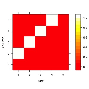
A <- matrix(
  c(0,1,0,0,0,
    0,0,1,0,0,
    0,0,0,1,0,
    0,0,0,0,1,
    0,0,0,0,0),
  nrow=5, byrow=TRUE
  )
levelplot(A,col.regions = heat.colors(100))
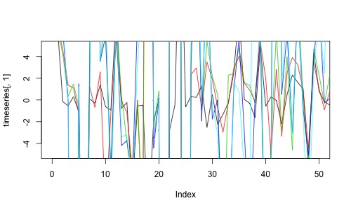
Now with the rmvDAG package we can simulate timeseries.
dag <- getGraph(A)
timeseries <- rmvDAG(300,dag,errDist="cauchy")
plot(timeseries[,1],col=1,type='l',ylim=c(-5,5),xlim=c(0,50))
for (t in 2:5){lines(timeseries[,t],col=t)}
Let’s estimate the partial correlations from the simulated time series.
estimate <- partial.cor(timeseries,tests=TRUE)
estimate
Partial correlations:
         1        2        3        4        5
1  0.00000  0.85156  0.00771 -0.02899  0.02567
2  0.85156  0.00000  0.46612 -0.00529  0.01003
3  0.00771  0.46612  0.00000  0.24697 -0.05361
4 -0.02899 -0.00529  0.24697  0.00000  0.88994
5  0.02567  0.01003 -0.05361  0.88994  0.00000

 Number of observations: 300

 Pairwise two-sided p-values:
  1      2      3      4      5

1        <.0001 0.8947 0.6187 0.6595
2 <.0001        <.0001 0.9276 0.8633
3 0.8947 <.0001        <.0001 0.3572
4 0.6187 0.9276 <.0001        <.0001
5 0.6595 0.8633 0.3572 <.0001

 Adjusted p-values (Holm's method)
  1      2      3      4      5
1        <.0001 1.0000 1.0000 1.0000
2 <.0001        <.0001 1.0000 1.0000
3 1.0000 <.0001        0.0001 1.0000
4 1.0000 1.0000 0.0001        <.0001
5 1.0000 1.0000 1.0000 <.0001
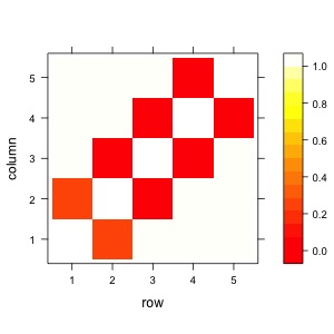
We want to save the false positives and the false negatives. For that, we can extract the p-values.
out <- estimate$P
out
1        2        3        4        5
1 ""       "<.0001" "1.0000" "1.0000" "1.0000"
2 "<.0001" ""       "<.0001" "1.0000" "1.0000"
3 "1.0000" "<.0001" ""       "0.0001" "1.0000"
4 "1.0000" "1.0000" "0.0001" ""       "<.0001"
5 "1.0000" "1.0000" "1.0000" "<.0001" ""
The p-values are strings and have "<.0001", so we need to clean that a bit.
out <- ifelse(out=="<.0001",0.0001,out)
class(out) <- "numeric"
levelplot(out,col.regions = heat.colors(100))
Now let’s only look at the upper triangle. The lower triangle is the same.
mask <- upper.tri(A)
input <- A[mask]
output <- out[mask]
print(input)
print(output)
> print(input)
 [1] 1 0 1 0 0 1 0 0 0 1
> print(output)
 [1] 0e+00 1e+00 0e+00 1e+00 1e+00 1e-04 1e+00 1e+00 1e+00 0e+00
alpha <- 0.05/9
TP <- sum(input==1 & output<alpha)
FP <- sum(input==0 & output<alpha)
paste("True positives:",TP,"- false positives:",FP)
"True positives: 4 - false positives: 0"
TPR <- TP/sum(input==1)
FPR <- FP/sum(input==0)
paste("True positive rate:",TPR,"- false positive rate:",FPR)
[1] "True positives: 4 - false positives: 0"
Let’s write this simulation in a function, so that we can re-use it multiple times.
simulated_pvals <- function(dag){
  timeseries <- rmvDAG(300,dag,errDist="cauchy")
  estimate <- partial.cor(timeseries,tests=TRUE)
  out <- estimate$P
  out <- ifelse(out=="<.0001",0,out)
  class(out) <- "numeric"
  out
}
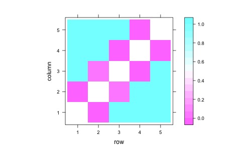
Check if this works.
out <- simulated_pvals(dag)
levelplot(out)
Now we can run a simulation and repeat this 1000 times.
tp <- fp <- c()
for (sim in 1:1000){
  out <- simulated_pvals(dag)
  output <- out[mask]
  tp[sim] <- sum(input==1 & output<alpha)
  fp[sim] <- sum(input==0 & output<alpha)
}
print(paste("True positive rate:",mean(tp/sum(input==1)),
    "- false positive rate",mean(fp>0)))
[1] "True positive rate: 0.7695 - false positive rate 0.06"
Now let’s look what happens when we change our function so that two signals are somewhat mixed. This is parallel to an atlas where the boundary would be somewhat off.
simulated_pvals_mixed <- function(dag){
  timeseries <- rmvDAG(300,dag,errDist="cauchy")
  hlp <- 0.95*timeseries[,1]+0.05*timeseries[,3]
  hlp2 <- 0.05*timeseries[,1]+0.95*timeseries[,3]
  timeseries[,1] <- hlp
  timeseries[,3] <- hlp2
  estimate <- partial.cor(timeseries,tests=TRUE)
  out <- estimate$P
  out <- ifelse(out=="<.0001",0,out)
  class(out) <- "numeric"
  out
}
tp <- fp <- c()
for (sim in 1:1000){
  out <- simulated_pvals_mixed(dag)
  output <- out[mask]
  output <- ifelse(output<alpha,1,0)
  tp[sim] <- sum(input==1 & output==1)
  fp[sim] <- sum(input==0 & output==1)
}
print(paste("True positive rate:",mean(tp/sum(input==1)),
    "- false positive rate",mean(fp>0)))
[1] "True positive rate: 0.7475 - false positive rate 0.227"
Key Points
fMRI data is a time series of 3D images of the brain.
Visualising and manipulating fMRI nifti images can be done with neurobase.